
|
| Remote monitoring and Geographic Information Systems (GIS) |
| M&E Overview | Remote Monitoring | Mobile Data Collection (MDC) | GIS | Case Study | Getting Started |
 |
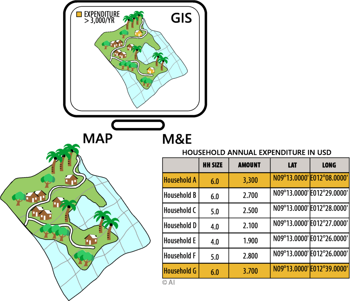
In the strictest sense, a GIS is a computer system capable of assembling, storing, manipulating and displaying geographically referenced information, i.e. data identified according to their locations. A GIS makes it possible to link, or integrate information that is difficult to associate through any other means. Thus, a GIS is able to use combinations of mapped variables to build and analyze new variables. Presenting data in the form of a map helps to understand the significance of where, when, and by whom. GIS is designed to capture, store, manage, integrate, and manipulate various layers of data, allowing the user to visualize and analyze the data in a spatial environment. On its own, Monitoring and Evaluation (M&E) can serve as an effective management tool that improves the prospects of achieving desired objectives, and outcome for any given project. Adding a GIS-based map output to M&E can dramatically improve the effectiveness and communications of results to management, and stakeholders. M&E and GIS are fundamentally different; M&E is temporally focused on measuring changes and outcomes occurring over time, while GIS is spatially oriented – identifying where the outcomes are occurring. By combining M&E and GIS, remote monitoring provides a powerful means for articulating program performance, and impact. Performance indicators must have a spatial
orientation In Enugu state in Nigeria, primary health centers (PHCs) play a vital role in the state's efforts to provide universal health coverage (UHC) for its poorest citizens. Beneficiaries enrolled in the scheme access a host of healthcare services through the PHCs. Some PHCs each month are servicing a high number of beneficiaries, while some service only very few. In an attempt to understand the reason for the disparity in the number of beneficiaries accessing services at the PHCs, a GIS mapping of PHCs was conducted. The map on its own did not reveal much; however, when a map of access roads was overlaid on the map of the PHCs, it suggested that the PHCs servicing fewer beneficiaries were not accessible by road. While this in itself may not necessarily be the sole contributing factor, it is quite revealing, and demonstrates the kinds of insights that GIS can provide. |
||
 |
|||
| Handouts | |||
| What GIS is NOT | |||
| GIS is more than a map | |||
| A single layer doesn't tell us much | |||
| Additional layers provide unique insights | |||
| Connect | ||||||
| FAQ Glossary Blog |
About Resources Contact Us |
|||||

|
||||||
| Copyright ©2021 AI Solutions | ||||||